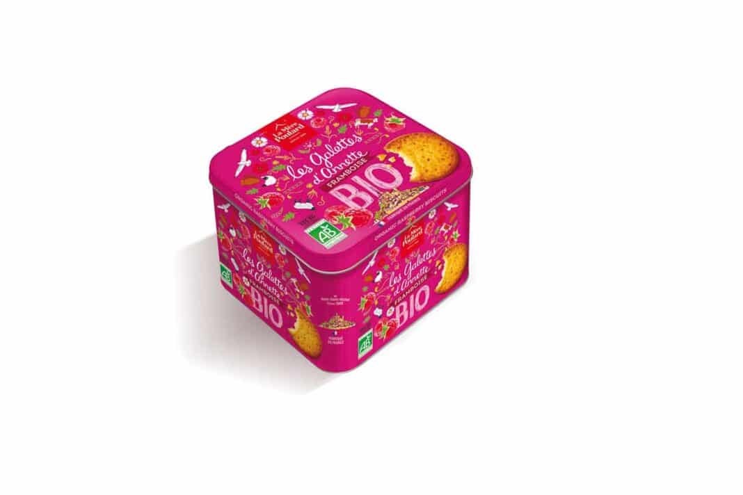
La Mère Poulard continues its packaging collaboration with the consulting company specializing in business strategy ManEcho to renew its “iconic” biscuit boxes.

New range of Breton pancakes
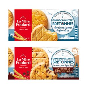
Another new packaging by ManEcho, a new range of pure butter Breton pancakes finely enhanced with a touch of fleur de sel, launched in GMS. The blue and white background packaging of these new cakes immediately refers to the traditional Breton biscuit recipe., as well as their place of origin and production : the historic biscuit factory of Maen Roch, a few kilometers from Mont-Saint-Michel. With a design that nods to the sea spray of the Breton coasts, the Ermine as a reminder, the red sailor pompom, the illustrative style of Mère Poulard asserts itself and positions it as an authentic brand. The character of Mother Poulard also features prominently on the facing of the new packaging., as guarantor of good taste on a daily basis and the brand’s demand for superior quality.


